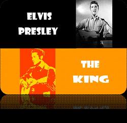
The assignment was to come up with a poster using the style, fonts and colors of a time period in the past of a popular music idol of that time. I chose the 1950's.
8/16/2011 Todd M.
I began the poster idea searching for font styles in 1957 because that's when someone I know was born. Choosing a font style that year-specific was proving to be next to impossible. Just the font style of the '50s was the next idea. Then I did a search for 50's posters. One of Elvis's posters popped up. I noticed that there was a lot of orange, red, and black & white in the posters of the decade. I remembered my mother was a huge Elvis Presley fan. She died a few years back so I went with Elvis as my favored star of those times. I liked him too though. Now I had the idea of who would be my poster's star and began looking for copyright-free pictures. Downloaded several and worked two of them into my poster.
I needed to be able to see what kinds of fonts they used, so I looked for posters with lots of type/copy. They used quite a bit of big, round, plump, and chiseled letters in various posters that I found. I found that they were fond of 'Helvetica' and 'Verdana' fonts, but they didn't seem right to me. Searched for 50's font styles again and found a site with similar looking fonts to the posters. Photoshop didn't have the first one and I didn't like Verdana. I picked the Showcard Gothic font (fontspace.com).
I had one color photo and one black & white photo. After playing around for a while I had chose black with white letters for the type above the black & white picture. I had planned on using orange and red letters below the colorized picture. While trying to get all the background and foreground colors to sync, I tried to change the background behind a picture; I accidently solarized it. I liked what it did and so did my wife, so I played with that and ended up with what I turned in.
References
fontspace.com. (n.d.). Free fonts tagged retro, 1950s. Retrieved August 16, 2011, from fontspace: http://tinyurl.com/1950sfonts
Google. (n.d.). Google. Retrieved August 16, 2011, from Google: http://google.com


6 comments:
Cool! Love it. :D
Thank you! <3
It looks real good.
It would be kind of nice to know a little about what you were assigned. I mean your poster looks great but if your assignment was a 500 word paper on how font styles have changed in the last 50 years, I would have to say you could have done better. (I am assuming your assignment was *not* a 500 word paper...) I think you could spare a sentence and fill us in just a little. This is going in as "Anonymous" but, They Are Not Aware
Thanks for the comment, Mrs. Not Aware. Just so you know, I updated my blog so the first sentence explains why I did the poster :)
That's coll, thanks. I have a much better understanding now. BTW, if you do have any papers you need to do, I would be happy to eyeball them for you--spellcheckers do not make for good proofreaders.
They Are Not Aware
You're welcome. Yes, I will/do keep you in mind when I write for class assignments. Thank YOU :)
Post a Comment